
Why are our homes so white?
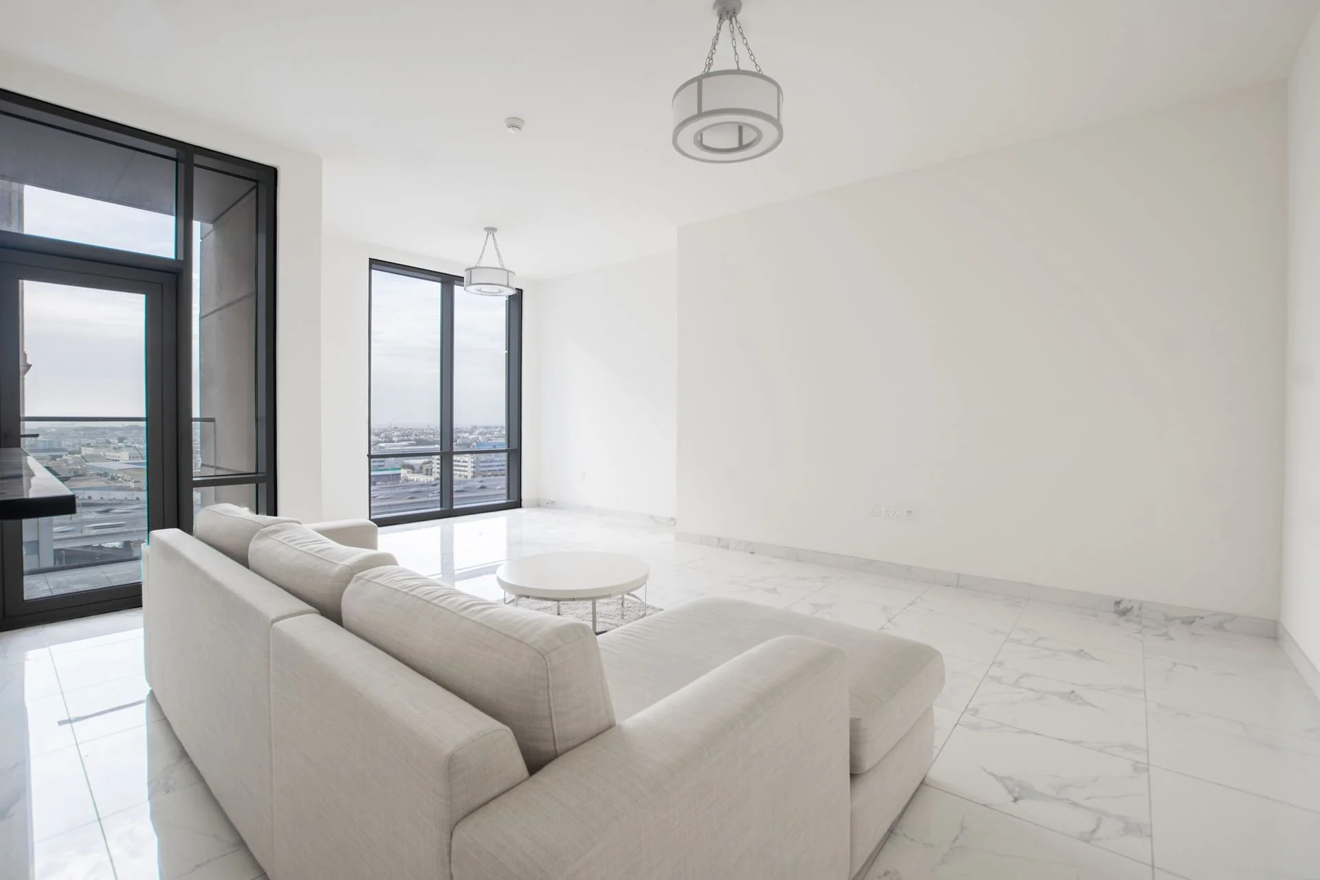
Image: Waqas Ilyas, Pexels
Somewhere along the line, white walls became a default in our homes. One need only do a quick scan of any real estate site to see the plethora of white dominating spaces everywhere. White, and the absence of colour is regarded as safe, non-offensive and neutral. However, the history of white in architecture and design is intertwined with ideas around class, progress and technology. While shades like Lexicon Quarter are now commonly deployed in living rooms, there was in fact a time when it was wildly radical to paint a room all white.
White was a reaction against ornate embellishment.
White walls themselves are nothing new. Whitewash has been around for centuries, and was originally a mixture of lime, chalk and water to help sanitise spaces or keep structures cool. It is seen in vernacular architecture worldwide. Because it was cheap and easy to apply, it was often used in poor rural homes. In Western design, white walls were not always the default, at least not for the wealthy. For example, in Victorian era interiors, coloured walls, wallpaper and embellishment were the norm for those who could afford decorative luxuries. Gallery and salon walls were painted in deeply coloured jewel tones and art hung in elaborate frames. Melbourne’s NGV International has a room emulating this way of exhibiting works, where paintings pop against the red background.
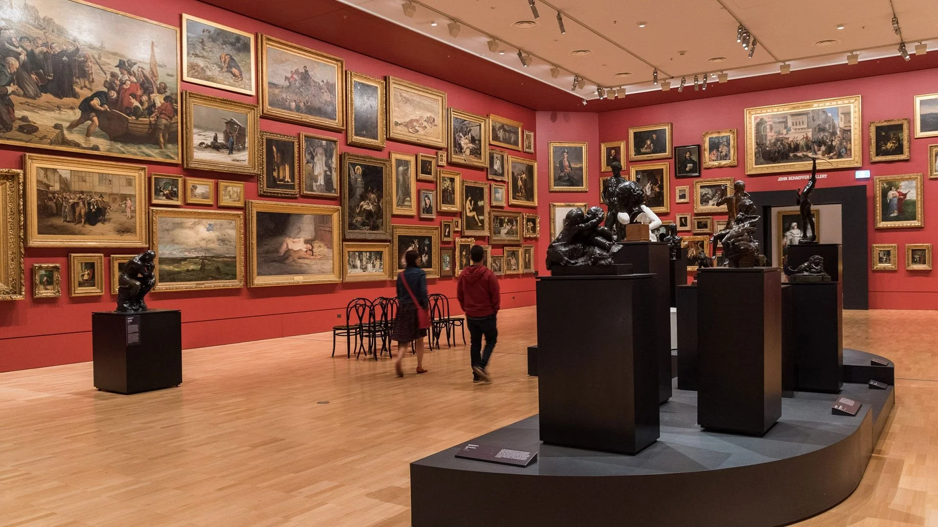
Image: Salon hang at the Melbourne NGV. ngv.vic.gov.au
Design preferences began to shift in the late 1800s with the Arts and Crafts movement. As Sally-Ann Huxtable observes,
‘The use of white as the base colour in an interior can be understood as a radical act of design, a defiant response to the layering of jarring colour, pattern and ornament in the mainstream Victorian interior’
Early white walls took cues from Japanese ceramics. Blues and greens were set off against a pale room, like the porcelain ceramics that these spaces were to house. Designer William Morris created handcrafted furnishings and sought to improve people’s lives through design. However, Morris recognised that most people could not afford his elaborate coverings and textiles, so he idealised ‘a sanded floor and whitewashed walls’ and equated white walls with beauty, affordability, and simplicity.
In domestic spaces, white gained popularity in the early 20th century. Ironically, the aesthetic Morris associated with affordability became more prevalent in wealthier avant-garde homes. Dark colours hid the soot and smoke of gas-lit rooms that polluted the walls, and clean white walls could only be achieved with ongoing maintenance. Although white in common urban domestic spaces was easily stained, this very quality was useful in institutional spaces where dirt could be quickly seen and eliminated.
White as an aesthetic preference co-incided with electric lights in elite urban residences where artificial illumination changed how light bounced in a room. Suddenly, rooms were bright. Syrie Maugham designed aspirational white interiors for high society, which contributed to its popularity in homes and earned her the title ‘The Princess of Pale’. Her all-white room in her own home unveiled a layering of white-on-white, where white walls normally seen in a humble cottage were decorated with high-end white furnishings.
White as a symbol of modernity.
Architecture historian Mark Wigley states:
‘The identity of modern architecture seems inseparable from the whiteness of its surfaces’.
While there were many architects and designers using white in the early 20th century, one of the first collective visions of white modern architecture came in the form of the Weissenhofsiedlung in Stuttgart in 1927. This was an international showcase of modern housing projected to the world. Off-white was chosen for the exteriors to create a unified image for the diverse range of architects. However, only a third were actually all white. There were several painted in light exterior shades, and even more with interiors blocked with colour. Even Le Corbusier, a vocal proponent for the compulsory whitening of architecture, showcased a villa with Pierre Jeanneret that contained swathes of blues, reds, greens, browns, and yellows. How the houses were presented to the world mattered. Black and white photos of the era stripped the spaces of colour upon reproduction, so that many believed they were devoid of colour.
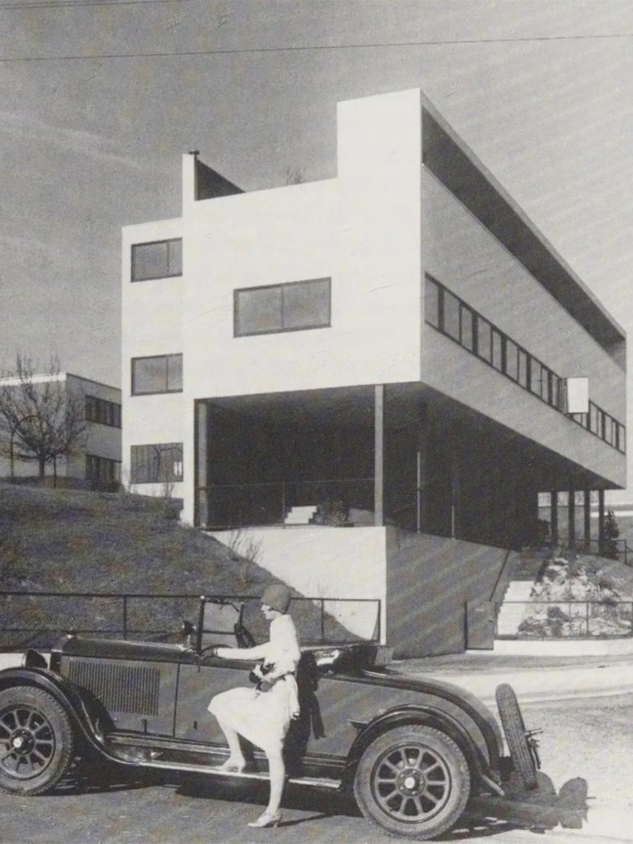
Image: Advertisement for Mercedes Benz, with Weissenhofsiedlung house by Le Corbusier and Pierre Jeanneret, 1927. From the Mercedes Benz historical archives.
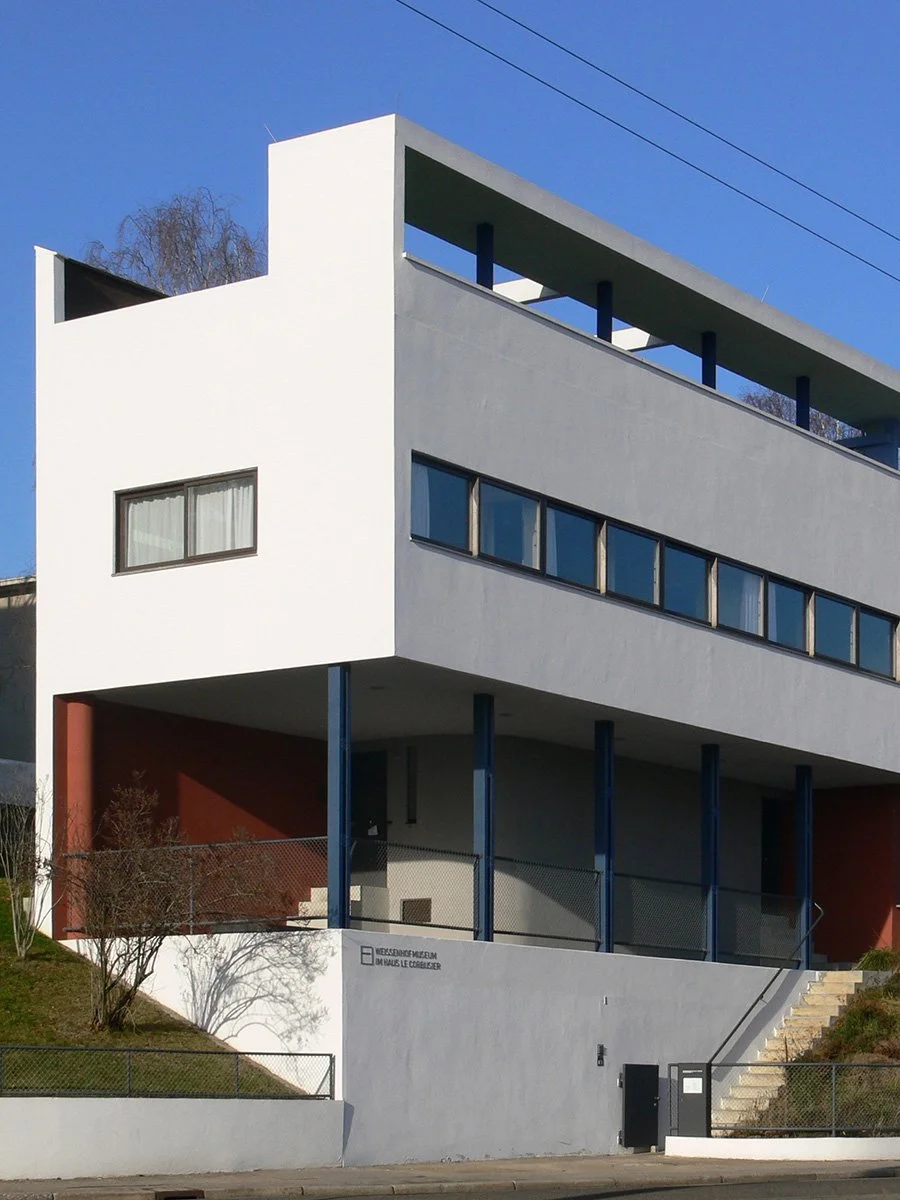
Image: Weissenhofsiedlung in colour. Andreas Praefcke, CC BY 3.0 via Wikimedia Commons
White became synonymous with modernity; key figures argued that it was moral, truthful, and purifying. Colour, ornament, and applied textures were seen as frivolous so surfaces were stripped back and cloaked in a layer of paint. The ‘White Cube’ aesthetic in modern art and galleries emerged in the 1930s. Intended to minimise distraction from the artwork itself, it eventually trickled down further into residential spaces.
Mass-production, commodification, and globalisation.
The white we are familiar with today is very different to early white. Bright white was difficult to achieve, and white paint was toxic containing ingredients such as lead. It wasn’t until the 1940’s that an affordable, mass-produced and safe paint formula using titanium dioxide was widely used in interiors, and became the crisp stark staple we know of today.
Fast forward to 2026 and white surfaces are everywhere. Today’s preference for white goes hand in hand with the commodification of housing, and globalisation of visual trends. White is the ‘safe’ choice for selling or renting homes, as it is viewed as a blank canvas that does not offend the prospective buyer/renter.
Popular design aesthetics such as Hamptons style, Scandi, Japanese, and Japandi are shared globally through imagery online and in print, thus influencing the homogenisation of spaces. The prevalence of juggernauts such as Ikea in every corner of the globe helps people access aesthetics with ease, and white becomes a trend to be consumed. Although there have been ebbs and flows of popular colour choices in different decades, white has remained constant. After the 2008 global financial crisis, white, and its close bedfellows grey, beige and greige dominated as the hues of choice, as the scarcity mindset took hold. Normcore became the norm and minimalism prevailed, but the result is a flattening of design.
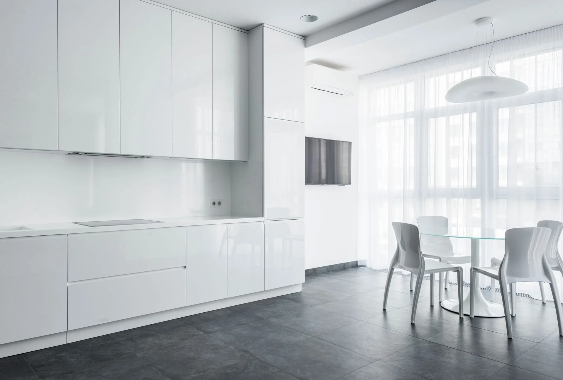
Image: Max Vakhtbovych, Pexels
White certainly has its place. Used intentionally, it can enhance spatial volumes, details, and light beautifully. But used as a default we have repetitive, sterile spaces that say nothing in order to appeal to the masses. There is a fatigue with the whiteout of spaces, with disparaging terms such as ‘landlord white’, ‘landlord special’, or ‘boring white box’ now frequently being voiced.
The next time you reach for the tin of Vivid White, consider the reasons. Is it by default? Does it achieve the desired mood? Could there be an alternative? White surfaces carry a fascinating history and its use has been intertwined with meanings that have evolved over time. It was never neutral.
Sources and further reading:
BOOKS AND ESSAYS
David Batchelor, Chromophobia (Reaktion Books, 2000).
Mark Wigley, White Walls, Designer Dresses: The Fashioning of Modern Architecture (MIT Press, 1995).
Mark Wigley, “Chronic Whiteness,” e-flux Architecture, November 2020.
Sally-Anne Huxtable, “White Walls, White Nights, White Girls: Whiteness and the British Artistic Interior, 1850–1900,” Journal of Design History 27, no. 3 (2014): 237–255.
Brian O’Doherty, Inside the White Cube: The Ideology of the Gallery Space (University of California Press, 1999; originally published 1986).
ARTICLES AND ONLINE SOURCES
ABC News, “Where Did the All-White Home Colour Trend Come From?” (17 November 2018).
https://www.abc.net.au/news/2018-11-17/where-did-the-all-white-home-colour-trend-come-from/10482824ABC News, “Grey, Beige and the Rise of Bland Interiors, Architecture and Fashion” (13 August 2023).
https://www.abc.net.au/news/2023-08-13/grey-beige-interior-design-architecture-fashion/102698676Titanium Dioxide Manufacturers Association, “White Interiors: A Timeless Colour Throughout the History of Design.”
https://www.tdma.info/uses-of-tio2/white-interiors-a-timeless-colour-throughout-the-history-of-design/